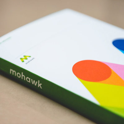
Mohawk Chip Charts
CLIENT: Mohawk Fine Papers
AGENCY: Michael McGinn Design / Standard Issue Design
ROLE: DESIGNER
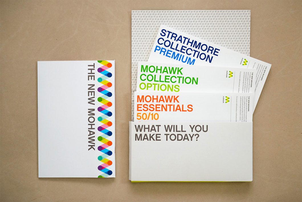
When Mohawk Paper underwent a major rebrand, they asked Michael McGinn Design Office to create a set of swatchbooks to introduce customers to their new consolidated paper offerings.
We designed a unified sampling system that could be applied across all of Mohawk’s product lines and provide an introduction to their papers in a more cost-effective and user-friendly format than traditional waterfall or screw-post swatchbooks.
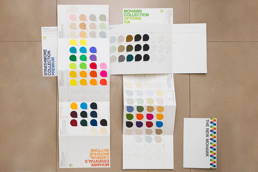
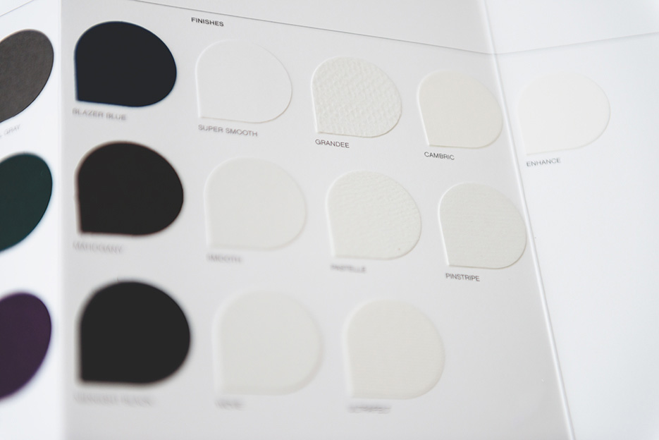
Each collection has its own accordion-folded booklet introducing the collection, with small teardrop-shaped chips to show the available colors and finishes.
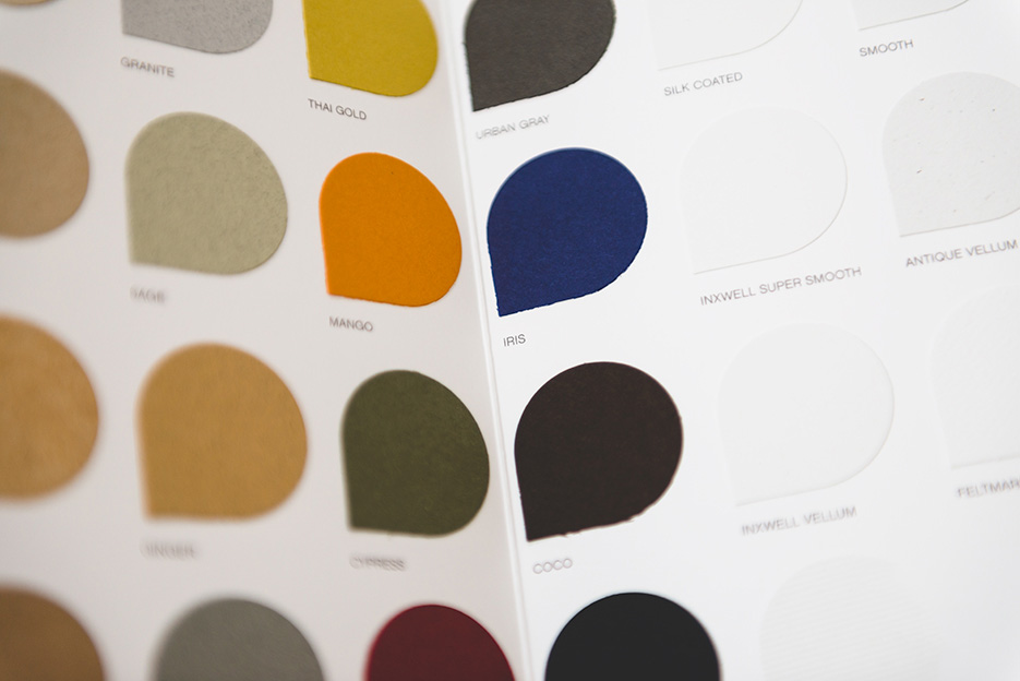
The unique teardrop shape of the chips plays off of the new Mohawk monogram, and allows the textured paper swatches to be glued on in the proper orientation.
An inspirational brandbook and sleeve round out the set of chip charts.
Photos courtesy Naina Redhu: https://www.naina.co/